
Tatton Park is an amazing oasis for nature, history, learning and events. There is a diverse range of things going on for all ages throughout the year. This is reflected in the various themed marketing materials that are produced on an annual basis. The client felt that the variety of this marketing only highlighted the need for a brand refresh, and for a new identity that would work in harmony with the diverse range of marketing collateral that it was being applied to.
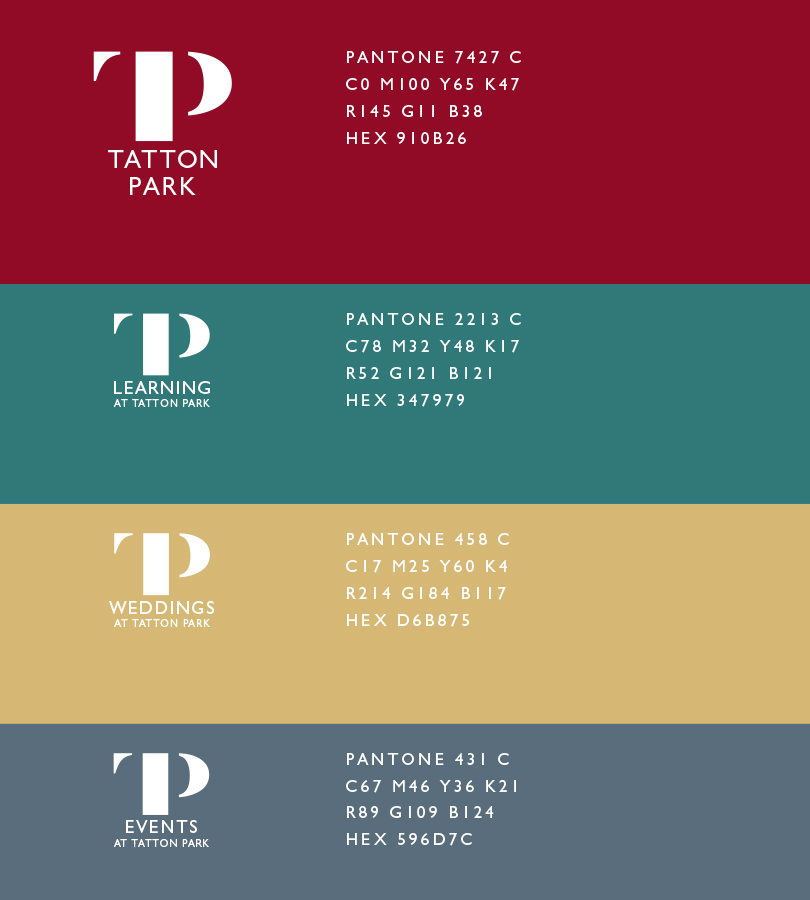
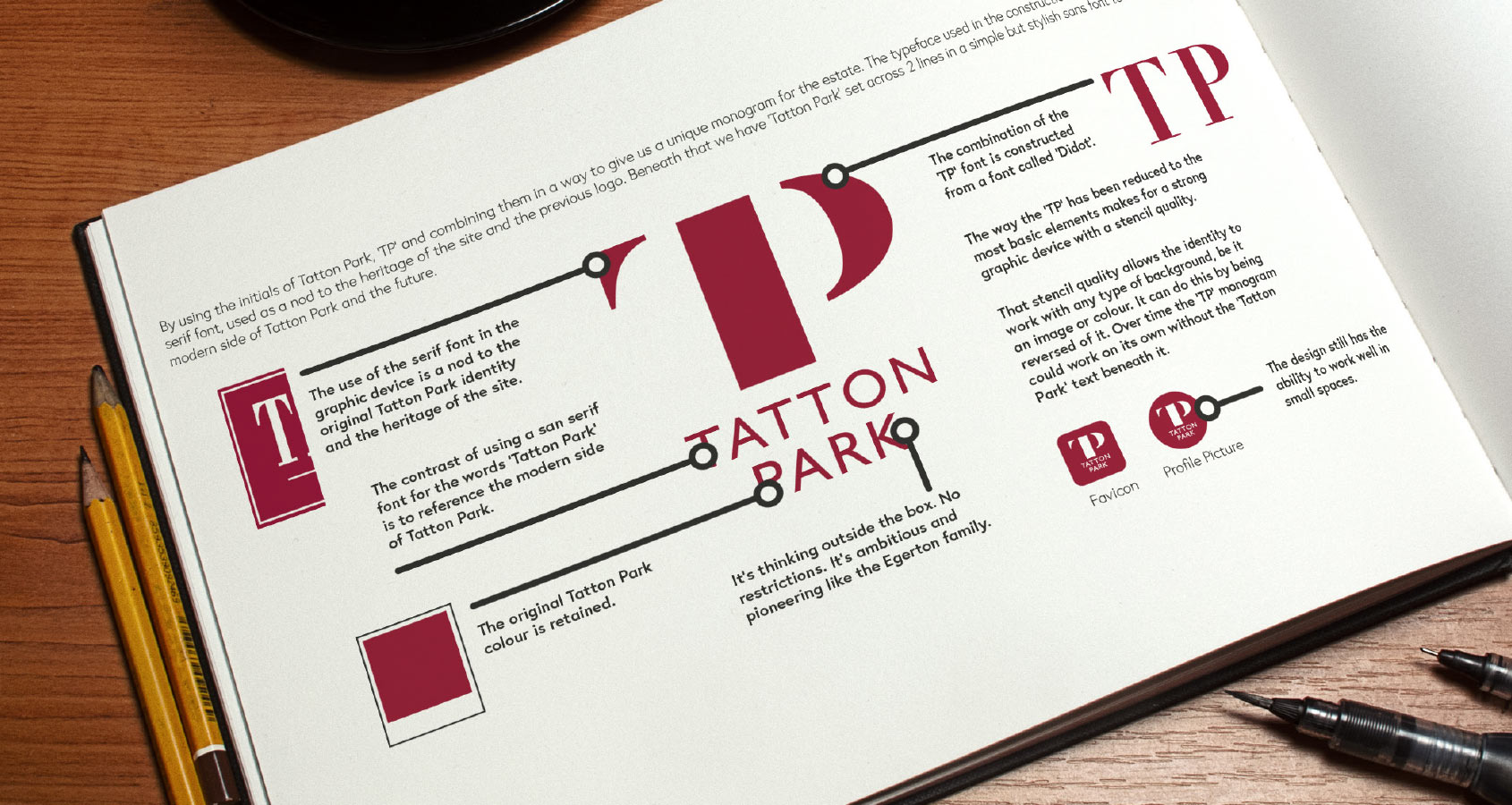
After a lot of client consultation and research we produced a design that combined the initials ‘T’ and ‘P’ to form a unique monogram. This new identity takes inspiration from the symbolic V&A and old National Theatre identities. The graphic form of the ‘TP’ monogram has a bold stencil-like quality about it, allowing it to work in harmony with promotional content rather than it is appearing like it has just been stuck on top. This allows the new identity to integrate seamlessly into whatever themed content that it is applied to.
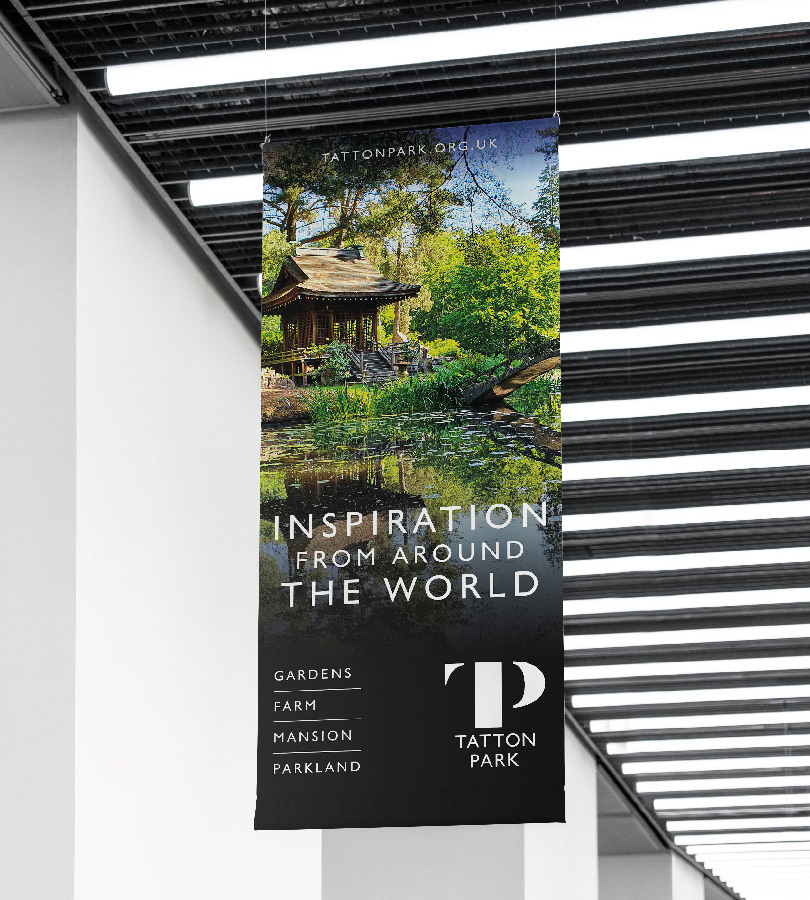
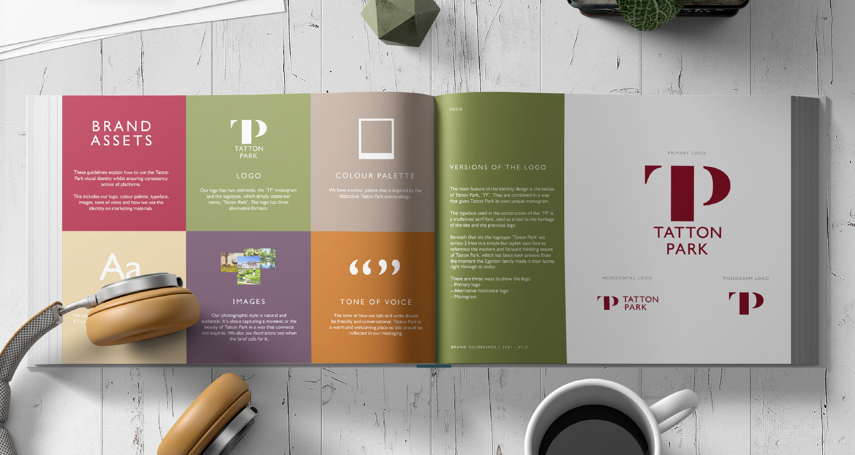
The new Tatton Park brand has a comprehensive set of brand guidelines and has now been applied to several assets including the website, signage, uniforms and advertising.

