

The original Synexus brand identity was established almost 20 years ago and had established a certain amount of brand equity during this period. Synexus knew elements of the brand needed to evolve without having to do a full rebrand. Our role was to do a brand refresh by refining and enhancing key elements other than the brand marque. The project presented us with the opportunity to strengthen the Synexus brand and its application on a global scale.
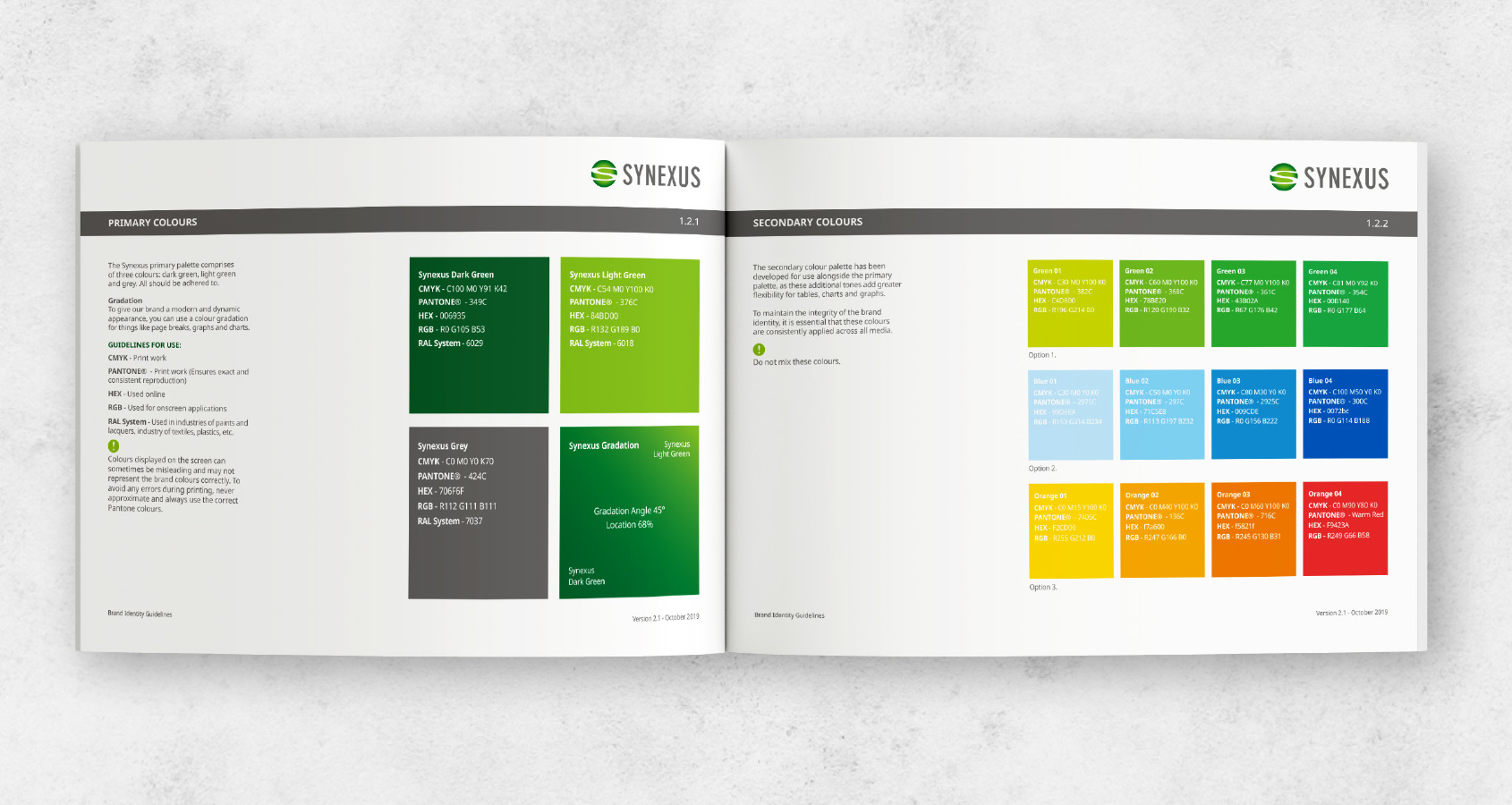
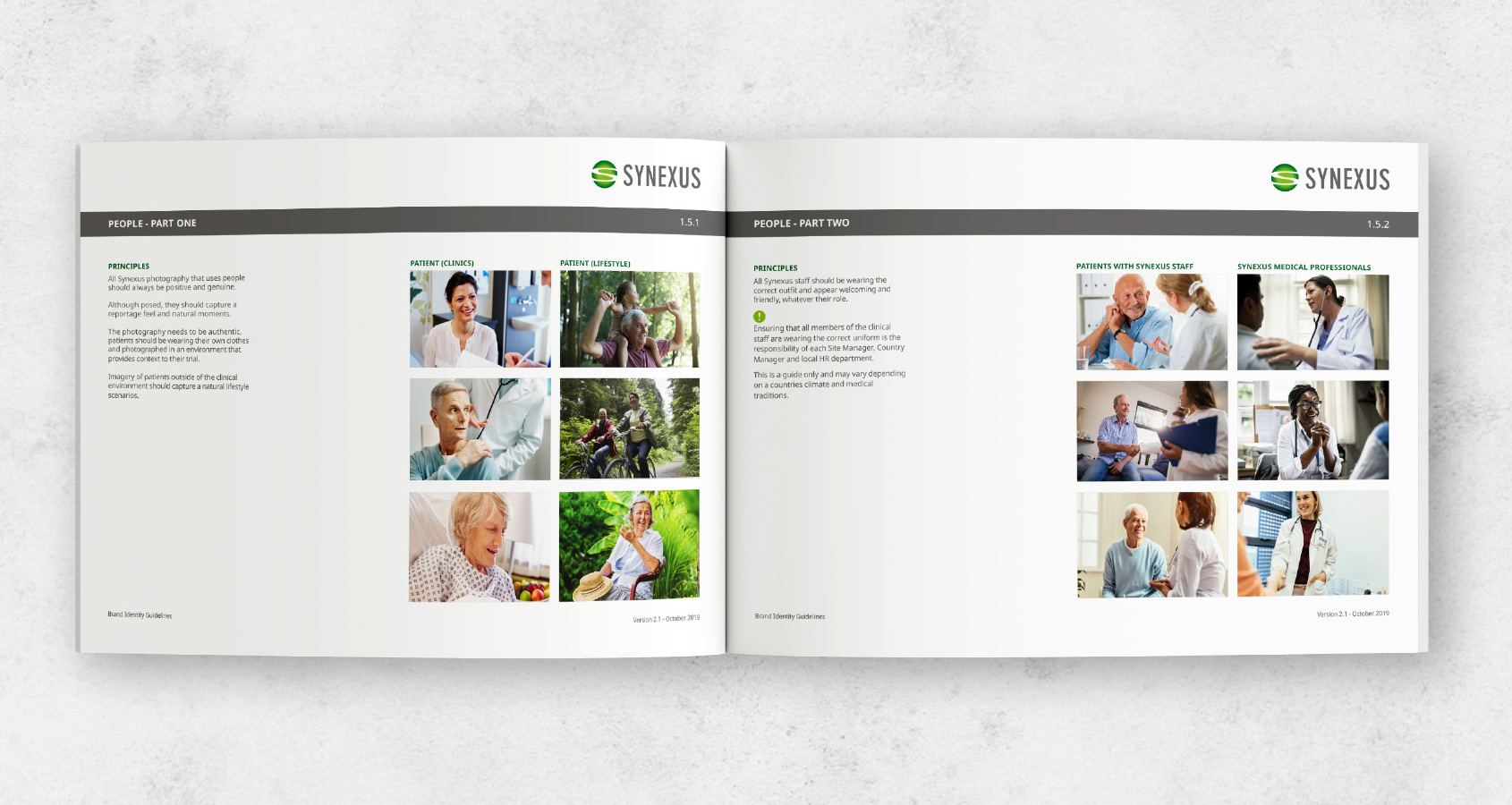
The Synexus Brand Identity Guidelines have been developed to help Synexus communicate across a spectrum of applicable media and materials. Consistent implementation of these guidelines is vital to the future success of the Synexus brand.
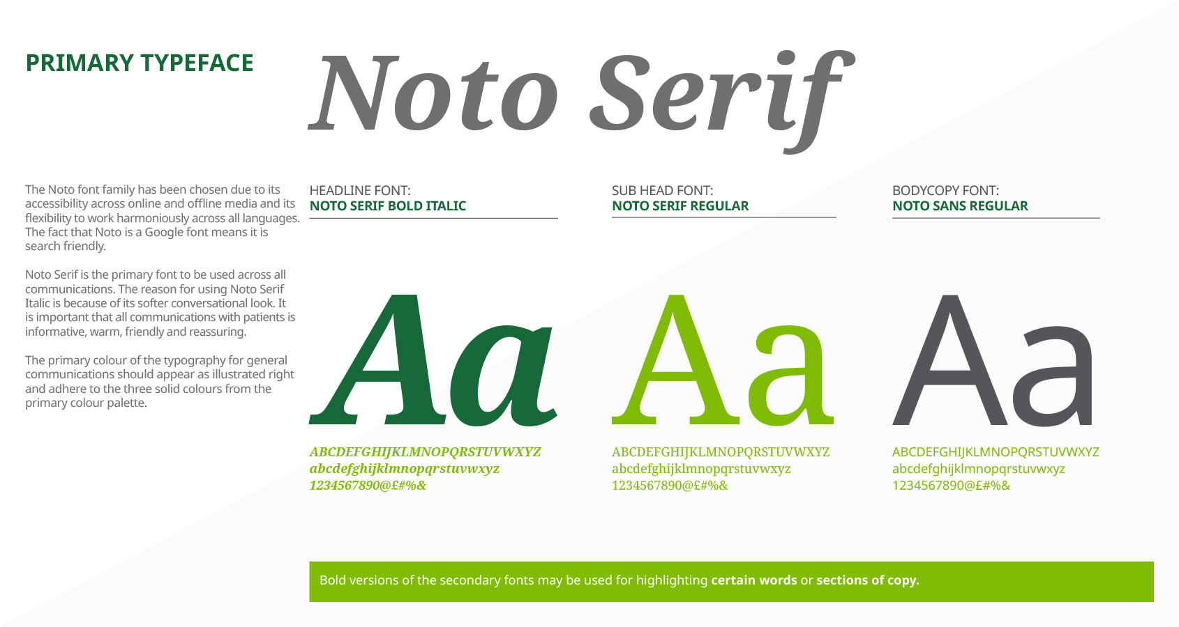
The new brand elements that we introduced included the Noto font family, chosen due to it accessibility across on and offline media and its ability to work with all languages, which is important when needing to communicate across 5 continents. We also introduced a new suite of icons to deliver certain information in a stylish and concise manner. These were just a few key elements we enhanced as well as the colour palette and photo library.

